Rethinking the pillars of expertise of a major
European group
- Identity & Branding
- Brand Content
- Website
- Art
- UX Design
- Art Direction
- WordPress development
The brief
Founded in 1975, SCC is one of Europe’s largest independent IT groups. Historically known for distributing IT equipment and associated services to its customers (Thales, Safran, ADP, Orange, Foncia, etc.), SCC wanted to review the presentation of its marketing offers to make them more understandable.
The challenge
How do you redefine the pillars of expertise of a technology player whose BUs have been gradually built up over almost 50 years?
Our answer:
- 01. Audit and strategic recommendations
- 02. A new, coherent and unified graphic identity
Audit and strategic recommendations
strategic recommendations
The result was a number of shared aspirations between the entities, such as the desire to streamline the current names and provide a directly tangible benefit by putting the customer back at the centre of these names.
We therefore recommended abandoning the product approach, pointing out that technology is only a means and contributes to positioning the company as a simple aggregator of technological solutions.
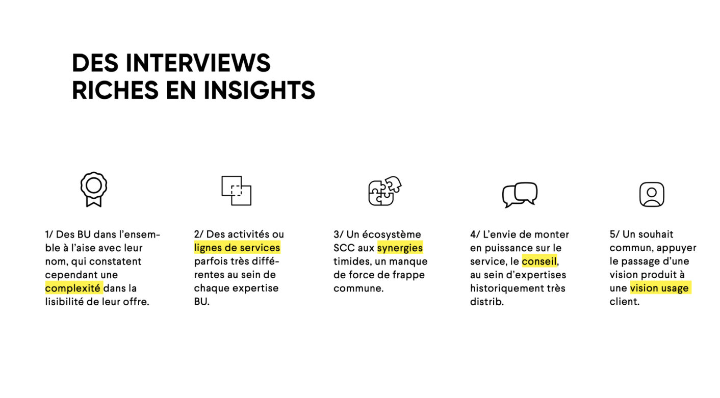
A two-pronged approach was therefore proposed:
- The holistic approach, telling the story of the BU’s value proposition from a bird’s eye view, without focusing on a specific business marker.
- The benefits approach, adopting the customer’s point of view, to express an immediate interest in use (pull VS push strategy).
This combination allowed a double reading, clarifying the meaning.
Each new name has been combined with the company name as a common denominator and a specific baseline, always centred on the value proposition of each business line.
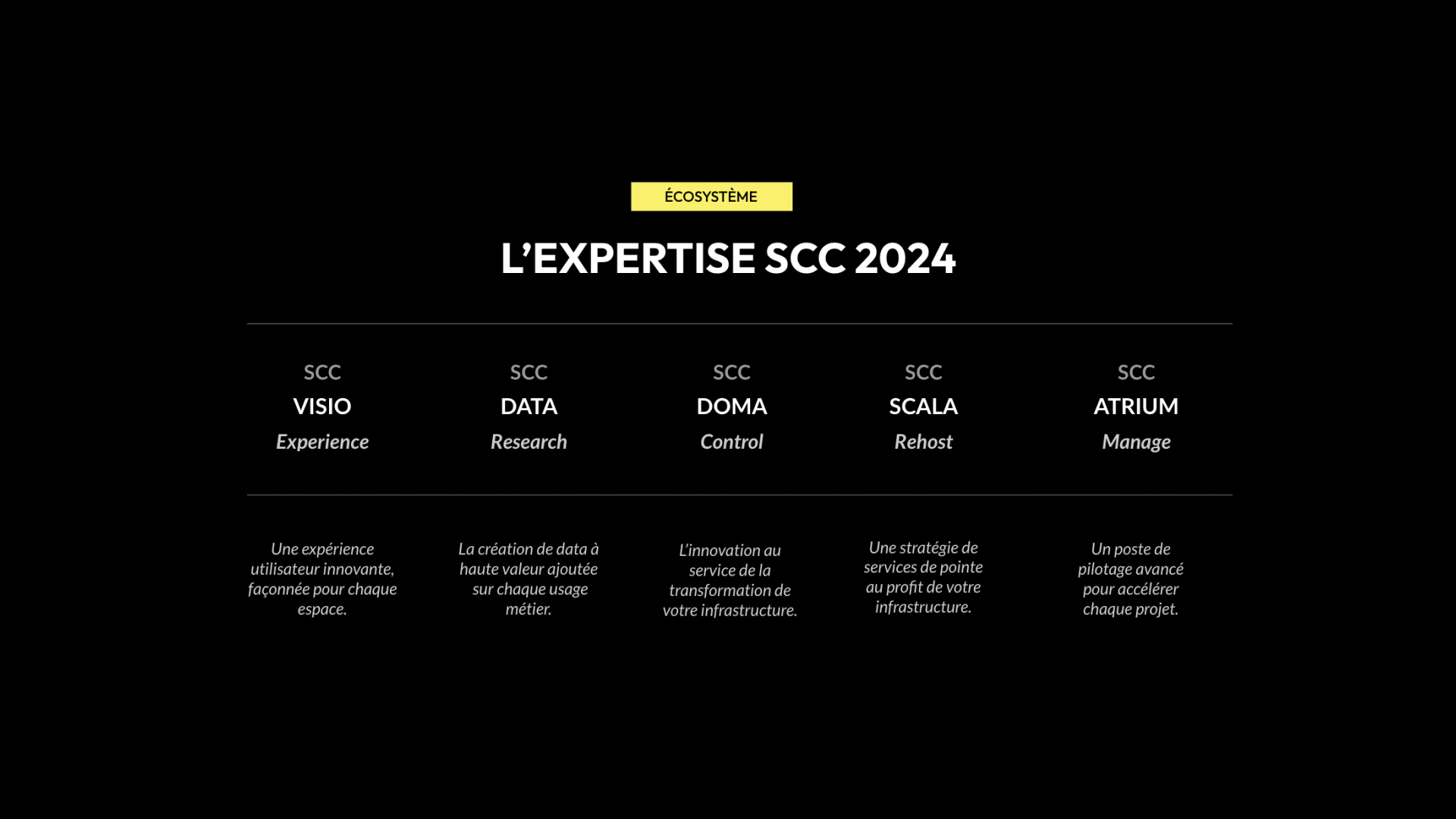
A new graphic identity,
coherent and unified
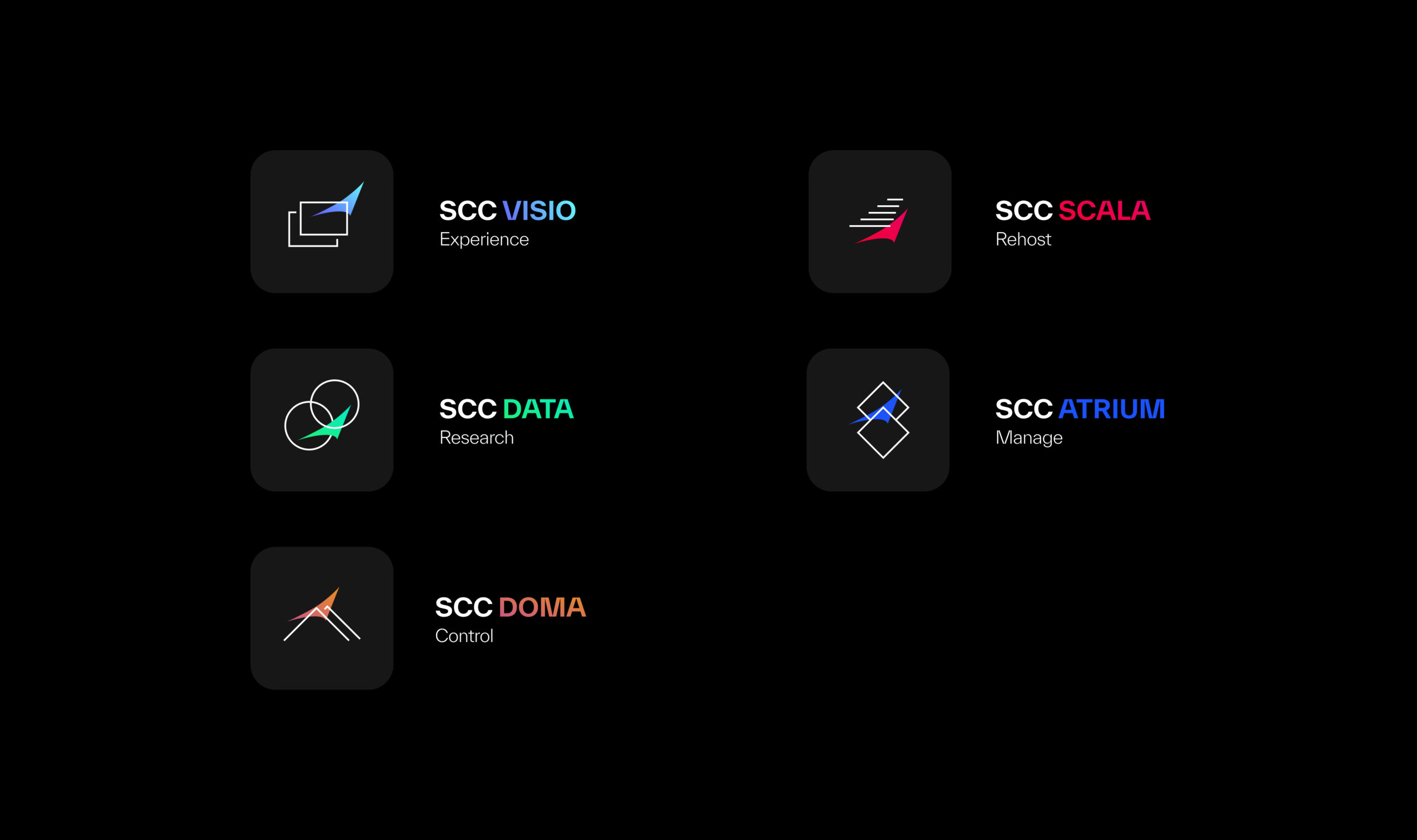
However, each of them must be perfectly identifiable by the user. Each expertise in the SCC suite therefore has its own graphic universe, composed of an icon and a distinct colour scheme.
To ensure that SCC’s new direction is smoothly adopted, we have decided to integrate existing graphic markers for at least the first year: the sail (SCC’s strong symbol) and the typography and colours of the current charter.
This new identity is intended to evolve over time and become independent of the SCC universe.
Work
together
We put all our expertise at your service in order to carry out well-thought-out and well-executed projects alongside you. We look forward to meeting you.