Create
the symbol of a whole
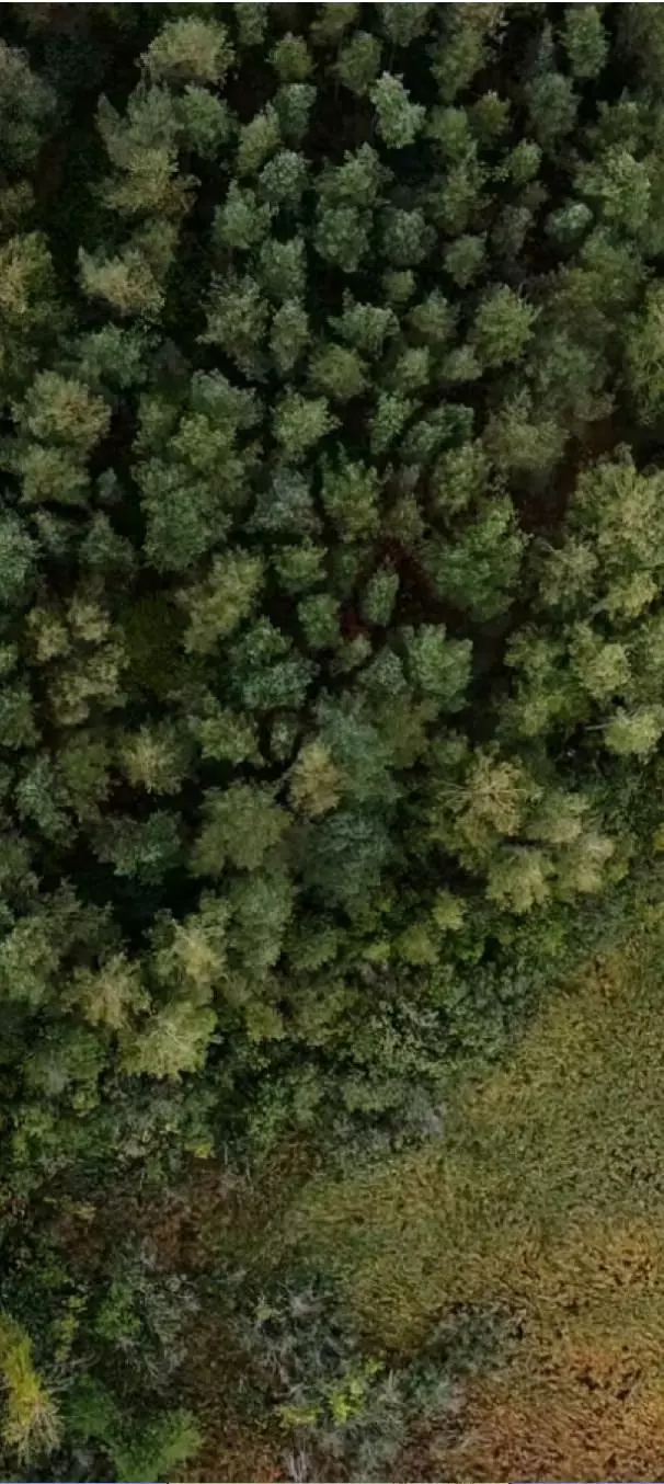
natural
ecosystem
the symbol of a whole
natural
ecosystem
Foundation for Nature Preservation
- Identity & Branding
- Associations & Public Organizations
- Art Direction
- Identité
The brief
In 2022, the “Foundation for the Protection of Wildlife Habitats” officially becomes the “Foundation for Nature Preservation”. This name change is an opportunity to define a new identity, while highlighting 40 years of experience in favor of biodiversity. The Foundation called upon the Bien-Fondé agency to design a perennial and more modern graphic universe.
The challenge
How do we create a visual identity that instills a new dynamic and highlights the Foundation’s missions?
Our response
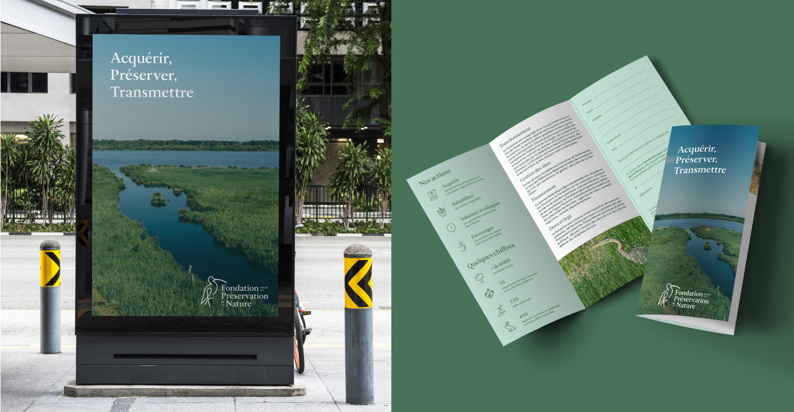
- 01. Creation of the logo and the graphic charter
- 02. Design of posters and flyers
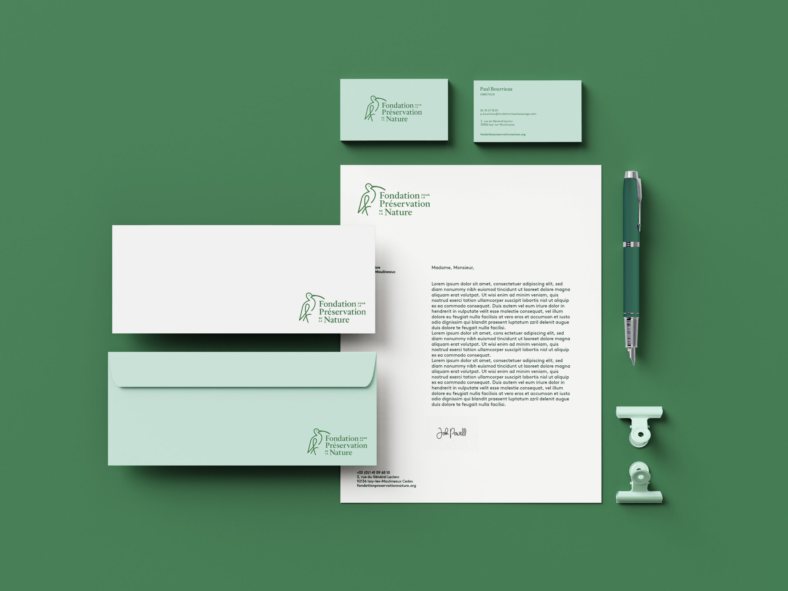
- 03. The visual declination of stationery supports
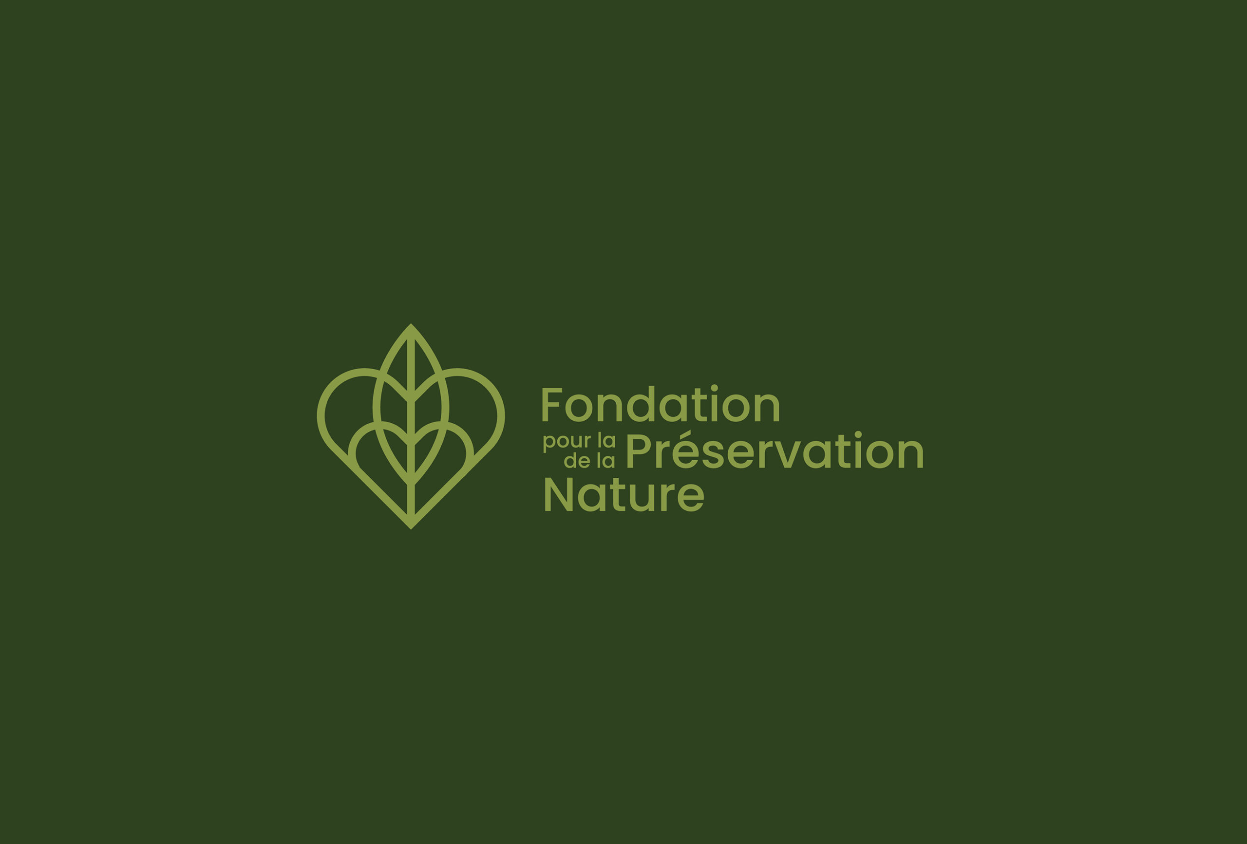
Creation of the logo
and the graphic charter
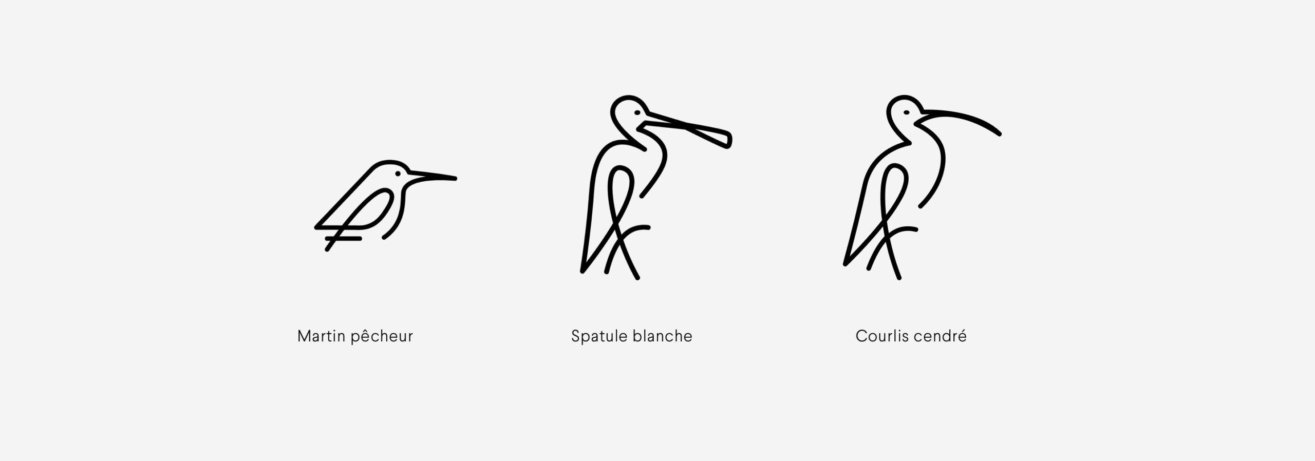
Then, the definition of a typography is also an essential asset to the charter since it must transcribe the educational, serious and friendly aspect of the collective. This is why we turned to a light and timeless typeface to reinforce the positioning of the Foundation.
The choice of colors plays an important role as well. They must reflect the values conveyed: know-how, sustainability, trust and transparency.
Thus, our choice is naturally oriented towards a palette that reflects nature and retranscribes the notion of territory: a dominant green color with soft tonessober and elegant.
Work
together
We put all our expertise at your service in order to carry out well-thought-out and well-executed projects alongside you. We look forward to meeting you.