Redesigning the identity
of a premium IT freelance platform

- Identity & Branding
- Start-up
- SMEs & Mid Sized Companies
- Art Direction
- Identité
The brief
Cherry Pick is a selective, quality-based platform that puts companies and IT freelancers in touch with each other.
Having reached a stage of maturity, the brand no longer fully reflected its high-end positioning or the quality of its support.
We were asked to rethink Cherry Pick’s visual identity in order to modernize its image, reinforce its premium dimension and structure a coherent universe across all its media (platform, website, social networks, sales).
The redesign aims to visually translate Cherry Pick’s promise: a human, fast and demanding match between companies and talent.
The challenge
How do you move an existing identity towards a more premium territory, without breaking with its historical codes or losing legibility?
Our solution
- 01. A redesigned symbol to embody matching
- 02. A structured graphic system for greater consistency
- 03. An embodied, human-centered visual territory
A symbol redesigned to embody matching


The new symbol is based on a circular shape structured around the junction between Cherry Pick’s “C” and “P”. This construction visually translates the meeting between a recruiter and an IT talent, a clear and immediate point of connection.
A play of light within the symbol reinforces this idea of selection. It evokes the choice of the right profile, the one that stands out, in keeping with the platform’s promise of high standards and quality.
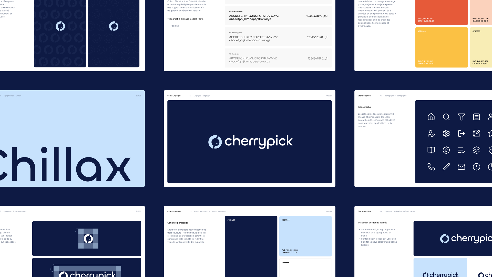
A structured graphics system for greater consistency
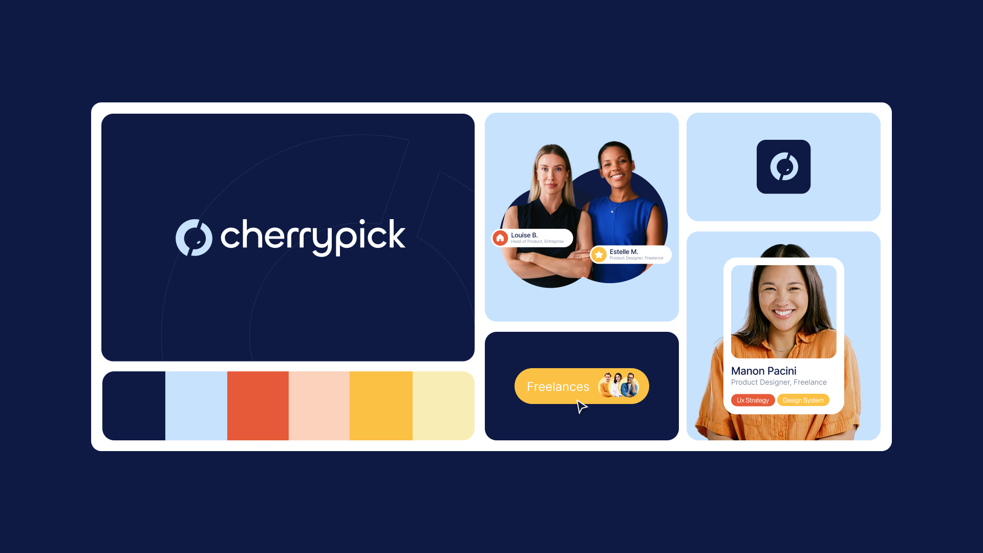
We defined a sober, premium main palette, dominated by deep blues, complemented by warmer secondary colors to bring contrast and dynamism. The typographic system is based on a combination of Chillax, used to structure brand expression, and Inter to guarantee legibility and efficiency in everyday use.
This is complemented by graphic elements derived from the logo, linear iconography and motifs to ensure consistency, recognition and flexibility across all media.
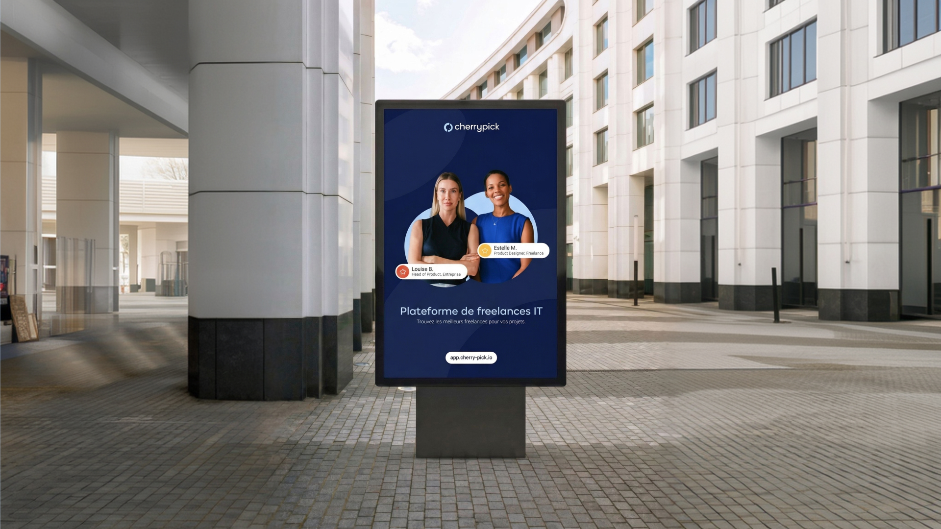
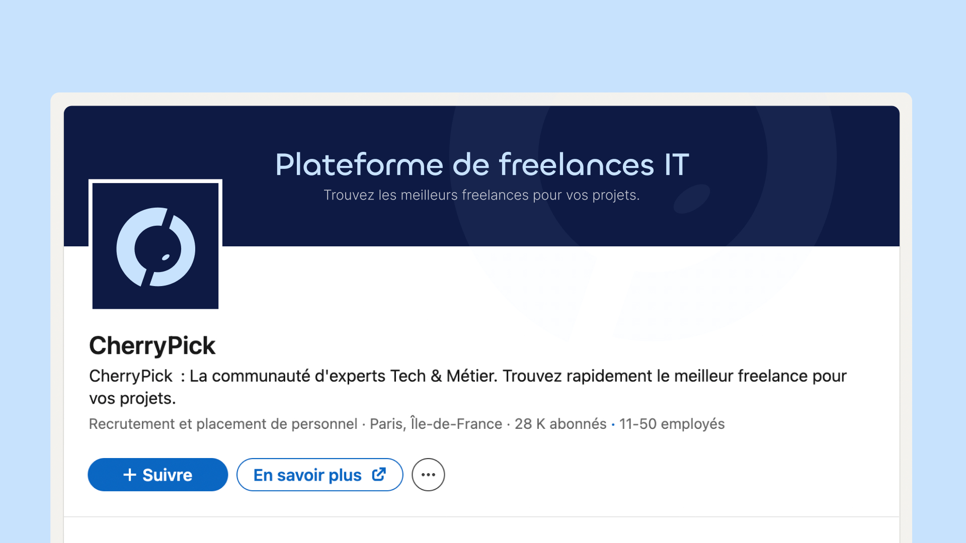
An embodied visual territory, focused on people

The compositions are based on the relationship between two profiles, recruiter and freelancer, embodying Cherry Pick’s promise of matching. The graphic elements of the charter are integrated into the background to structure the visuals and create an identifiable signature.
This system enables us to produce clear, adaptable key visuals for both digital and commercial use.
Work
together
We put all our expertise at your service in order to carry out well-thought-out and well-executed projects alongside you. We look forward to meeting you.